Sunday, 8 January 2012

Final Web Design


This is the final design of the supporting homepage for the book. I chose a simple four button menu and a display of the finished book advertised. I used a similar design in the background as the design on the actual book. I put an outer glow on the book and well as centred it in the homepage to add more emphasis on it. If I was going to improve it, I would change the colour of the text on the buttons and make them stand out a lot more because they look a bit faded.

Wednesday, 21 December 2011

Back Cover

WHen it came to designing the back cover, it was quite simple to create because I wanted it to be very similar to the front cover for consistency. I therefore useds the same colour schemes etc. here it is:


I decided to use characters from the book on the back cover to give the viewer insight into what characters will be in the story. I chose this typeface because it is thick and bulky allowing for easy read and it also fits into the whole theme quite well. I decided it should be white so that it stood out more and was readable. The only things I would have improved in this is the design of the characters. Some of them are cut off the side and I think that more characters could have been added at the expense of changing the size of the text slightly.

Saturday, 17 December 2011

Side Cover

I began work on the side cover of the book. I started by doing some sketches in my journal, I then narrowed it down to one simple design and began the designing process on photoshop. This is what the final looks like:


I wanted it to be clean and simple and fit in with the theme of the front of the cover. I used a different typeface to give the whole a design a bit of variety and seeing as books are displayed generally on the side this typeface will stand out more.

I used the digits in the background and kept the same colour theme as on the front of the book cover because it would look strange in any other format.

Wednesday, 14 December 2011

Peer Assessment

Today I had a peer assessment and had to show my work to the rest of the clasmates. I showed my design ideas, journal and blog and I was given overall a C-. I was expecting this considering my progress in terms of critical thinking and contextualisation. I have not yet began my learning report at this point which is what brought my grade down significantly. However the work as a whole I was told is pretty good but needs more analysis.

Wednesday, 7 December 2011

Final Cover Design


This is the final front cover I came up with on Photoshop. Once again I used the main character on the front but this time I didn't edit the colours used on him. I also only used a few simple but appealing colours to avoid creating to much on the image. This allowed the title to be really clear compared to the previous cover design.

Sunday, 4 December 2011

Initial Cover Design

This is the first digital design of the book cover:


For this one I took the original hero form the original cover and changed the colouring to fit in with this particular theme of blue and pink. Although I think it works well visually, it may not be as appealing as it could be to the target audience because pink is more of a 'girly' colour and will not appeal to boys of this age group. The text is also quite difficult to read because of the background. I will use this first design and improve on it.

Wednesday, 23 November 2011

Book Cover Decision

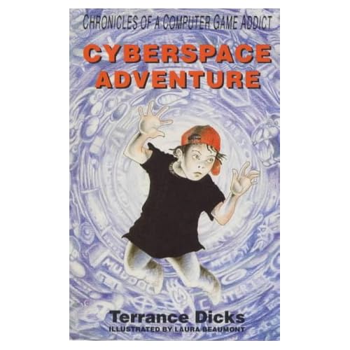
After researching book covers, I eventually chose the book I wanted to change the cover of:

(Cyberspace Adventure-Terrance Dicks)

This book is part of a series made by a famous English writer who is mostly popular for his scripting in the Doctor Who series on TV. He produced a large amount of books however. I immediately began to generate ideas on how to improve the overall design of the cover. A made several thumbnail sketches and a mind map to decide how the cover should look.